
Perspectives on Rightshifting
Perspectives on Rightshifting

Index
As this is a long post, here’s an index to each slide / dimension in the post:
Background
Introduction
Dimension: The Software Development Life Cycle
Dimension: Flow Mode
Dimension: Feedback Delay
Dimension: Administrative Project Management
Dimension: Perspective on the Individual
Dimension: Measurement
Dimension: Inductive vs Deductive
Dimension: Toolheads
Dimension: Quality and Testing
Dimension: Development Focus
Dimension: Risk Awareness
Dimension: Systematic Learning
Dimension: Design Loopbacks
Dimension: Conformance to Schedules
Dimension: Use of Third Parties
Dimension: Deployment Problems
Dimension: Variability in Project Success
Dimension: Metaphor in Use
Background
Way back in 2008, the first public outing for my ideas about Rightshifting was a forty-five minute presentation at Agile North 2008. The slides for this presentation have been online at AuthorSTREAM ever since (including, incidentally, a Part 2, that was not presented, featuring an introduction to FlowChain).
The presentation was very well received, but one thing that has rankled me since then has been the absence of any narrative to accompany the slides. I can appreciate that this absence limits the usefulness of the slide pack. As a remedy, I have reproduced the slides here, accompanied by a brief commentary, or explanation, for each slide.
[Note: the slides in this first draft, acting as placeholders, are taken from the original presentation. I may update them later, to the more recent 3D-effect format, if there’s any demand for that.]
Introduction
The presentation as a whole attempts to address the question “given that there is such a wide range of effectiveness between different knowledge-work organisations out there in the world, how does life – and work – in these organisations differ? What makes Rightshifted organisations so different (and thus, more effective) from their less effective cousins?”.
What is a Dimension?
What is a “dimension“, in this context? It’s a slice through – or aspect of – how things look or work in knowledge-work organisations everywhere. We might imagine mapping each organisation in the real world to a (fuzzy) n-dimensional point in an n-dimensional hypercube. This mapping reveals certain clusters, or commonalities between organisations.
The slides, one by one, each illustrate a different dimension of life and attitudes to work in organisations, accompanied by a commentary.
Note: These charts and their accompanying narratives illustrate tendencies, not so much hard and fast delineations.
Dimension: The Software Development Life Cycle
This chart illustrates the kind of software lifecycle prevalent in organisations at various stages of effectiveness:
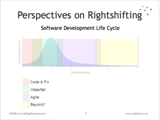
“Code and fix” refers to the disorganised, seat-of-the pants approach to developing software systems and products. Some folks refer to this as “cowboy coding”.
“Waterfall” (more accurately described as “batch and queue”) refers to those particular approaches to software development where each stage of transformation e.g. Analysis, Coding, Testing, etc.) is completed as a large single batch of work, before passing on to the next stage.
“Agile” refers to the various approaches to software development where work is conducted incrementally and iteratively, with early and regular delivery (into production) of increments in e.g. functionality.
“Beyond” alludes to other approaches to software development “beyond agile”.
Note: This slide preceded the Marshall Model by some two years. Even so, one can see the boundaries of the fours mindsets emerging.
Dimension: Flow Mode
This chart illustrates the prevailing (collective) mental model (and thus operational practices) with respect to how value flows through the organisation (e.g. from order to delivery, or “from concept to cash”):
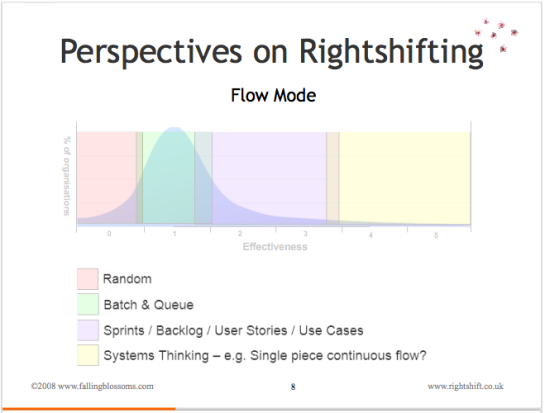
“Random” refers to the absence of any understanding about “Flow” (of value) , and thus an absence of any specific practices to enable flow, meaning that flow of value within the organisation happens at random. For example, the actual schedule of product releases – or due date performance – will be highly variable and unpredictable, to the point of being essentially random.
“Batch and Queue” Value flows through these organisations in (often, large) batches, with each batch – for example, an entire software product – queueing at various points during its passage through the organisation. These organisations generally have little conscious understanding of the idea of flow, of queueing theory, or of the other issues that contribute to smooth, predictable flow. Consequently, the actual schedule of product releases – or due date performance – will show marked variation and a significant lack of predictability.
“Sprints, etc” These organisations have a conscious understanding of the advantages of flow, and structure their operations around improving the flow of value through the organisation. However, these organisations have not yet transcended siloisation to the point where they can optimise flow across the whole organisation as a joined-up system. Thus, we may see the use of agile practices, such as iterative – or even continuous – delivery of user stories, features or use cases. As a consequence, the actual schedule of product releases – or due date performance – will show limited variation and reasonable predictability.
“Systems Thinking” refers to the mindset that embraces the whole organisation as a system, and optimises flow through this system as a whole. In concert with techniques like Statistical Process Control (SPC), this means that the actual schedule of product releases – or due date performance – will show generally predictable and minor variation.
Note: The boundary between “Sprint, etc.” and “Systems Thinking” segments may lie somewhat further to the left of the 3.2-3.5 position than it appears on the above chart.
Dimension: Feedback Delay
This chart illustrates organisational thinking on how long the feedback loops in the organisation should be:
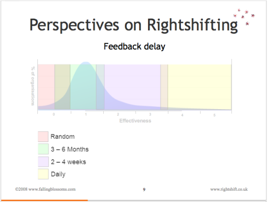
“Random” refers to the absence of any conscious attention to feedback and the length of feedback loops. Thus any feedback received from e.g. retail channels or customers about new products, product features, and the like will be acted on (or ignored) essentially at random, with the timescales (delays) for such action also, essentially, random.
“3 – 6 Months” these organisations regard a three to six month time frame for acting on e.g. customer feedback as quite normal and acceptable. Produce release cycles are typically geared around this timeframe. The concept of “cost of delay” is not often known.
“2 -4 Weeks” here, the concept of “cost of delay” is understood, and these organisations work towards quantifying and tracking these costs, and base their product investment and prioritisation decisions, at least in part, on these factors. This typically sees dramatic reductions in cycle times, bringing the time it takes to incorporate feedback from the market down to less than a month.
“Daily” highly-effective organisations tend to have a very clear understanding of their own cost-of-delay, and of the impact of feedback, and feedback delays, on their effectiveness. Not least because these kinds of organisation tend to be in the web space (c.f. Forward, Facebook, Salesforce.com, etc.), where cost-of-delay can be high, these organisations focus on cycle times and feedback delays of a day or less.
Dimension: Administrative Project Management
This chart illustrates organisational thinking on how work (in particular, product development work) should be structure and managed:
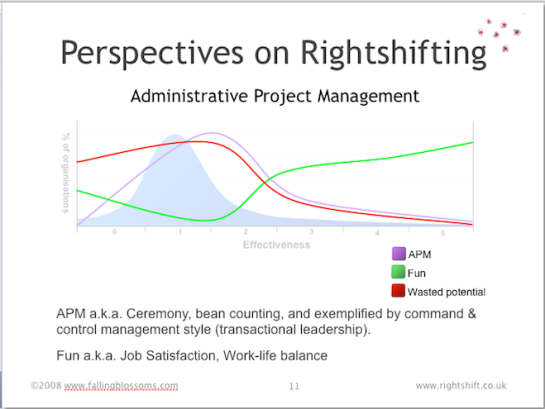
“APM” shows the prevalence of Administrative Project Management as correlated with organisational effectiveness. Least-effective organisations have little or no project management, nor indeed even projects, as such. Moving to the right, some slightly more effective organisations adopt the idea of conducting work within structures or containers called “projects”. Pretty soon after this comes the full panoply of Administrative Project Management, as typified by e.g. PRINCE2, PMBoK, etc.. As organisations’ effectiveness continues to improve, these (fewer) organisations come to understand the limitations of both the project concept itself, and the dysfunctions inherent in Administrative Project Management. The role of APM thus tails off.
“Fun” shows that although quite (relatively) ineffective, organisations to the left (little APM) are fairly fun places to work. People have a degree of autonomy, rules are absent or at least lax, and work is not so regimented or controlled. As APM increases, fun goes into a tailspin, reaching its nadir as APM reaches its zenith. This is no mere coincidence. As APM goes into decline, further to the right, fun rises again, and indeed reaches new heights, driven on by the satisfaction inherent in doing good work, delivering real value, and generally making a real difference. Highly-effective organisations tend to provide high levels of job satisfaction (aka fun).
“Wasted Potential” illustrates the correlation between APM and the waste of people’s innate potential (e.g. for doing good work). The key mechanism here is engagement. As fun drops (in line with rising APM), engagement with the work also drops away, and people have less incentive, motivation and thus inclination to do good work. See Dan Pink’s book “Drive” (and associated videos, etc.) for an in-depth explanation of the role of Autonomy, Mastery and Purpose in the intrinsic motivation of knowledge-workers.
Dimension: Perspective on the Individual
This chart illustrates how organisations at different levels of effectiveness have different attitudes towards individuals (e.g. workers):
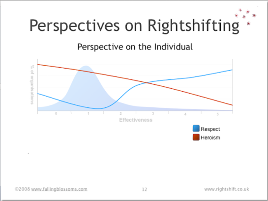
“Respect” maps the degree of importance which organisations attach to the idea of respect for the individual. The chart illustrates how the least-effective organisations, on the left-hand side, have some level of respect for their staff. This may be patchy, but overall, it’s about what you’d expect to find in wider society. As we consider slightly more effective organisations (progressing to the right), here we see respect for the individual decreasing as effectiveness increases. Respect reaches a nadir around 1.5 or the chart, (see also the preceding chart on Administrative Project Management) – here organisations tend to treat people as fungible, interchangeable “cogs” in the “machine” of the organisation. As this machine view of organisations begins to wane (further to the right again), respect accorded to folks in the organisation rapidly rises, easily exceeding the levels seen in wider society.
“Heroism” portrays the way in which highly-ineffective organisations attribute success and e.g. productivity to the heroic acts of individual “rock-stars”. As organisations progressively become more effective (rightshift), they likewise progressively tend to realise the role played by the system (the way the work works) relative to the contribution of “heroic” individuals. This realisation has knock-on effects on hiring, remuneration and a host of other organisational policies.
Dimension: Measurement
This chart illustrates the preferred role of measurement a.k.a. metrics in organisations at different levels of effectiveness:
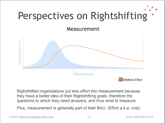
“Metrics Effort” illustrates how highly ineffective organisations place very little emphasis on measuring things, and thus on the place of evidence, facts and data, more generally, in the operation of the organisation. When organisations (eventually) do begin to value measurement, they tend to go overboard on the idea, spending much effort on collecting all kinds of measures, much of which has little relevance or utility. As effectiveness continues to increase, organisations’ focus tends to resolve onto the measures with most relevance to the effectiveness of the organisation, whittling-away the less useful measures. Also, these more effective organisations tend to embed measurement – and the use of measures – into daily operations (business as usual), rather than have special (out-of-band) measurement efforts. c.f. Basili et al – GQM.
Dimension: Inductive vs Deductive
This chart illustrates the balance of focus on working practices (sometimes called “best practices” as against principles (the ideas underlying working practices) – in organisations at different levels of effectiveness:

Here we see a direct correlation between effectiveness and a focus on principles over practices. That is to say, highly-effective organisations understand the principles underpinning their working practices, whereas ineffective organisations have little or no understanding of the fundamental principles involved. The latter organisations are much more likely to simply copy “best practices” from others. Often this amounts to no more than “cargo-culting“.
See also: “The Inductive Deductive Schism” for more context.
Dimension: Toolheads
This chart illustrates the general disposition towards the buying and using of tools – whether physical tooling (plant), software tools or indeed, methodologies – in organisations along the Rightshifting axis:
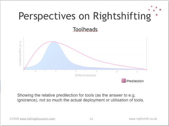
Highly ineffective organisations tend to see little value in buying or using tools to e.g. improve productivity or reduce variation. As effectiveness improves, organisations tend to go overboard, buying tools left, right and centre in the belief that tools improve efficiencies, and that tools compensate for a lack of specialists and their know-how. For organisations that continue to improve their effectiveness, however, comes the realisation that a blanket predilection for tools does more harm than good, and these organisations become much more selective about the tools they acquire and use, even to the point of retiring or disposing of much of their existing tooling.
See also: “Watch Out For the Toolheads” article by John Seddon
Dimension: Quality and Testing
This chart illustrates the general attitude towards quality, and incidentally, the role of testing, in organisations distributed along the Rightshifting axis:
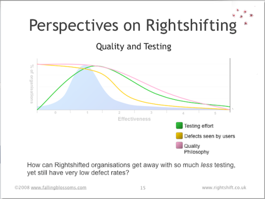
“Quality philosophy” speaks to organisations’ general philosophy on the matter of quality. Highly ineffective organisations, if they have any overt philosophy at all regarding quality, tend to believe that quality can be tested into their products and services (despite, incidentally, more than thirty years of TQM, Crosby et al., advising to the contrary). Highly effective organisation come to the realisation that quality is – at least in part – an economic concern, and whereas sometimes it may be cost-effective to retain some testing, more often the effective path to quality lies in reducing or eliminating defects.
“Testing effort” reflects the cost of testing, as seen in organisations at different levels of effectiveness. Highly ineffective organisation have low testing costs, simply because they have little or no testing (or any other quality efforts, for that matter). Organisations of moderate effectiveness tend spend a great deal of time, money and effort on testing things, primarily because they have little or no focus on reducing or eliminating defects, and thus have to rely on testing (a.k.a. inspections) to prevent defects reaching their customers. Highly effective organisations have discovered that by reducing or eliminating defects at source, the need for testing (a.k.a. inspections) reduces markedly.
“Defects see by users” illustrates the combined effect of an organisation’s quality philosophy and testing effort. Customers of highly ineffective organisations tend to see many defects and quality problems, whereas customers of highly effective organisations tend to see far fewer quality issues.
Dimension: Development Focus
This chart illustrates the typical stance of developers and product development groups in organisations distributed along the rightshifting axis:
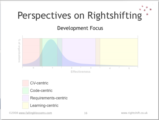
“CV-centric” refers to the tendency of developers and other technical specialists in e.g. highly ineffective organisations to focus on selecting and using technologies and tools that will enhance their CVs and give them interesting and cool new things to “play” with.
“Code-centric” describes the tendency for technical staff in low-effectiveness organisations to believe that code and code quality is the be-all and end-all with regard to producing successful software products and services.
“Requirements-centric” relates to moderately effective organisations’ belief that ongoing commercial success stems from understanding customers’ requirements and delivering against those requirements. Note: This does not necessarily imply a big-design-up-front or batch-and-queue approach to requirements gathering. Indeed, many requirements-centric (development) organisations quickly learn that iterative approaches to exploring requirements can afford more effective means for understanding.
“Learning-centric” pertains to the focus of highly effective organisation on continual, organisation-wide learning – including learning about customers and markets and their evolving needs and perceptions of value, but more importantly, continually learning more about how best to make the whole organisation work ever more effectively.
Dimension: Risk Awareness
“Greater risk brings greater reward, especially in software development. A company that runs away from risk will soon find itself lagging behind its more adventurous competition. By ignoring the threat of negative outcomes—in the name of positive thinking or a can-do attitude—software managers drive their organisations into the ground.”
This chart illustrates the awareness of, and approach to handling, development risk in organisations across the spectrum of organisational effectiveness:
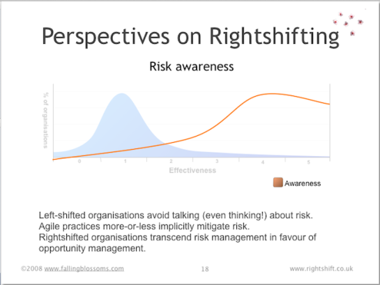
Highly-ineffective organisations not only remain unaware of risk and risk management disciplines, but often have a pathological fear of even discussing issues from a risk perspective (hence the negative portion of the line on the chart). Risk awareness rises oh-so-slowly as organisational effectiveness increases, with only the reasonably effective organisations achieving significant levels of awareness (and hence, effective ways to handle risk). The line tails off for the highly effective organisations, as these eschew some aspects of risk management in favour of effective and disciplined means of opportunity management.
See also: “Waltzing With Bears” by DeMarco and Lister.
Dimension: Systematic Learning
learning (ˈlɜːnɪŋ)
— n
1. knowledge gained by study; instruction or scholarship
2. the act of gaining knowledge
3. (psychology) any relatively permanent change in behaviour that occurs as a direct result of experience
This chart illustrates the typical attitude, of organisations distributed along the rightshifting axis towards, systematic (i.e. deliberate, organised and organisation-wide) learning:
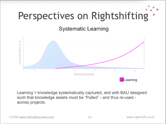
Highly ineffective organisations tend to be blind to the value of systematic learning. Moderately effective organisations, once awake to the possible commercial advantages of a systematic approach to learning, begin to institute means to encourage such learning. Highly effective organisations recognise the need for such learning to be integrated with Business as Usual (BAU) and to ensure that what is discovered is actually “learnt” – i.e. new knowledge actually modifies organisational behaviour.
Dimension: Design Loopbacks
“One of the fundamental problems companies have is this practice of continual loopbacks, where they think they made the right decision, but it was the wrong decision and they end up continually in firefighting mode, fixing problems on the back end.”
“If you look at the continual state of loopbacks and lost knowledge in companies, something like 70 percent of engineering talent is used to solve problems that should have been solved early on.”
~ Michael Kennedy
This chart illustrates the frequency and impact of “design loopbacks”, in organisations at different levels of effectiveness:
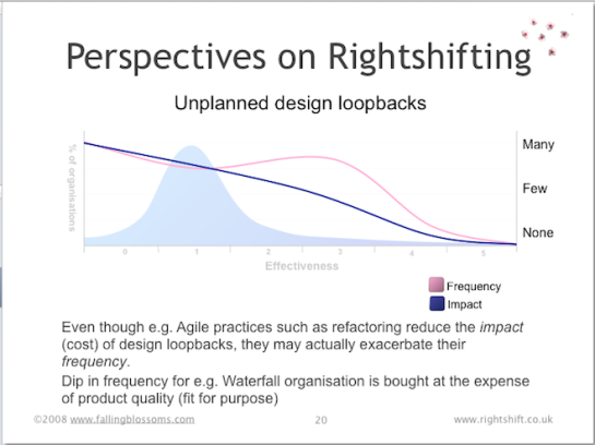
See also: “Product Development for the Lean Enterprise” by Michael Kennedy
Dimension: Conformance to Schedules
This chart illustrates the ability of organisations, at different stages of effectiveness, to deliver new products into production on time (i.e. on schedule, or on the due date):
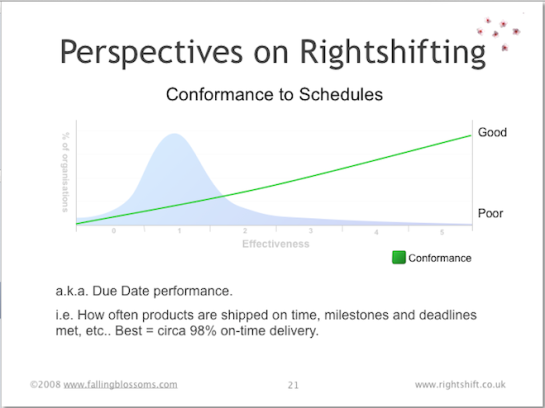
Here we see how well organisations meet their own development schedules. It’s probably no surprise that highly ineffective organisations struggle to deliver anything on time – with high variation and low predictability in their schedule conformance. But most (averagely-effective) organisations do little better. And few of these less-effective organisations realise that the best performers (the highly effective organisations) can have highly reliable and predictable schedule conformance as high as 98%.
Note: It may be apparent that to achieve such high levels of schedule conformance requires fundamentally different approaches to product design and development that those more commonly employed. Such approaches can include Set-based concurrent engineering (SBCE a.k.a. set-based design), trade-off curves, and other measures seen in e.g. the Toyota Product Development System (TPDS).
See also: Lean Product and Process Development by Dr Allen C. Ward
Dimension: Use of Third Parties
This chart illustrates the strategic role of third-parties (specialist suppliers, consultants, sub-contracting companies, etc.) as seen by organisations distributed along the Rightshifting axis:
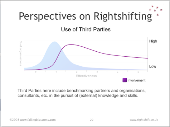
No organisation, however large or diverse, can hope to have all the specialist skills and know-how that might be needed to design and deliver new products and services into ever-changing markets. Thus working with specialist third-parties is often a necessity. Highly-ineffective organisations have little or no understanding or capability for finding, and working with third parties. Generally, these organisations will treat each such relationships as an entirely novel and unusual situation, discovering how to make it work as they go along. And repeating the whole exercise the next time…ad infinitum. Thus, these organisations, also often victims of NIH (not invented here) syndrome, rarely use third parties.
Moderately effective organisations come to realise that working with third parties is an inevitable part of doing business and evolve means to make this part of Business As Usual. Thus, these organisation come to use and rely-on third parties in many aspects of their business.
Highly-effective organisations, not least because of their fundamentally different approaches to doing things, find it increasingly difficult to find third-parties with the necessary specialist skills and cultural (mindset) “fit”. Hence, these organisations find themselves using third parties less than they perhaps might like.
Dimension: Deployment Problems
This chart illustrates the likelihood that organisations, at different stages of effectiveness, will have significant problems with their new products (or updates) after they’ve “gone live”:
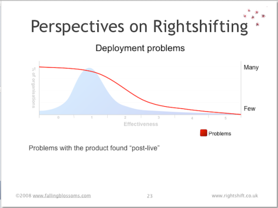
Many highly-ineffective organisations see it as inevitable that their customers, users, etc. will find problems with their new product designs when released (put into live production). Moderately-effective organisations begin to regard this as undesirable, realising the cost involved – both remediation costs and reputational costs, not least. These organisations, however, typically have an uphill struggle to reduce their level of deployment problems, basically because of their piecemeal approach to the “whole product” notion, borne of years or decades of incrementalism and local optimisations. Highly-effective organisations, often by dint of radical overhaul of their approach to “whole product” issues, have minimal deployment problems.
Dimension: Variability in Project Success
This chart illustrates variation in project (i.e. new product or service development) success, along the effectiveness spectrum. More significantly in my view, it also illustrates the different causes to which organisations at different levels of effectiveness attribute such variation:
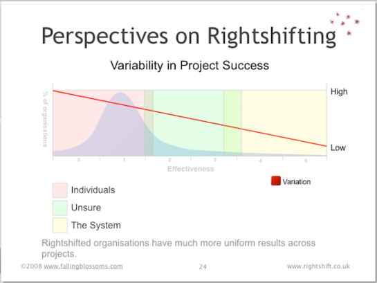
Here we see that highly-ineffective organisations have high levels of variation (and thus low levels of predictability, certainty) in their new product development efforts. Levels of variation fall in line with increases in organisational effectiveness.
As to causes, highly-ineffective organisations tend to attribute success (and variability thereof) to the heroic (or paltry) efforts of specific individuals. Moderately effective organisations tend to let go of that simplistic notion, but often get lost in their search for the root causes of the variability in their record of success. Highly-effective organisations have discovered that, as Deming suggests, circa 95% of their success at delivering projects is down to their organisational systems – or “the way the work works”.
Dimension: Metaphor in Use
This chart illustrates the prevailing metaphor for knowledge work, as it varies in different organisations along the effectiveness axis:
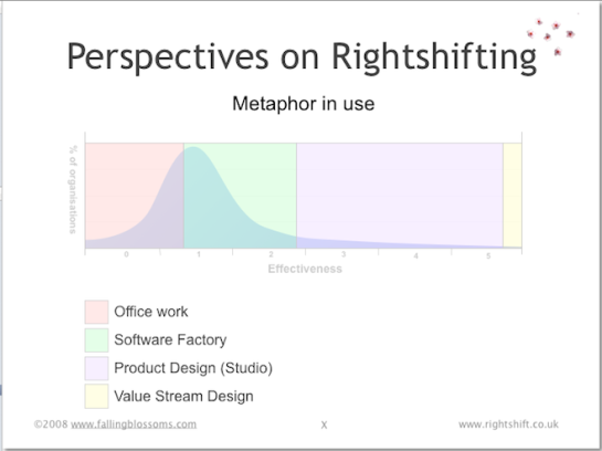
Highly ineffective knowledge-work organisations have yet to realise even the nature of the work in which they are engaged, choosing, mostly by default, to regard it as just another kind of “office work”. This choice of metaphor leads to certain choices regarding e.g. the layout of the work space (cube farms, segregation of specialists, absence of team spaces, etc.).
Organisations of limited effectiveness choose to adopt the “software factory” metaphor for work, with an abundance of manufacturing/factory related metaphors for all aspects of work, such as “production line”, “batch and queue”, “conformance”, etc.
Reasonably effective organisations eschew these metaphors in favour of work as “product design” or the “design studio”, choosing to regard the workers as “creatives”, and understanding the value of flow (in the Mihály Csíkszentmihályi sense of the word), creativity and innovation.
Highly-effective organisations, whilst appreciating the “design studio” metaphor and values, choose to adopt a “value stream” or “value network” metaphor for work, and place emphasis on the flow of value.
See also: “Principles of Product Development Flow” by Don Reinertsen.
– Bob

Pingback: Five Blogs – 22 July 2012 « 5blogs
Pingback: Impact Mapping: Making a big impact with software products and projects « Sprint Meister
Bob – Really useful article, thanks – can’t believe I hadn’t noticed it before via your site. Really fleshes out the rightshifting concept, so that I can, for example, place my current organisation meaningfully on the various dimensions and discuss with colleagues.
I’d be interested to know why highly effective organisations have so few design loopbacks – is this primarily a consequence of systematic learning and early feedback?
One small buglet – the Deployment Problems graph is labelled with the same paragraph as the Conformance to Schedules graph.
Hi David,
Thanks for reporting the buglet – now fixed.
Happy to hear you find this post useful. And your use for it, too. That was my intent – both in the original presentation and this updated version.
As to Design Loopbacks: Highly effective organisation evolve in their awareness (and root causes) of the waste involved, and therefore evolve techniques – such as rapid feedback, early to production, and Set Based Concurrent Engineering – to combat the issue. We might regard the emergence and evolution of such techniques as examples of “systematic learning”.
– Bob